The answer, my friend, is blowin’ in the wind. The answer is blowin’ in the wind – Bob Dylan
Let’s get rvested: using webscraping to pull all the data from all the sites
webscraping
API
music
sentiments
ggplot2
rvest
Published
June 6, 2023
This post uses the rvest package to scrape the web for data on movies, Bob Dylan song lyrics, and untranslatable words.
IMDbest
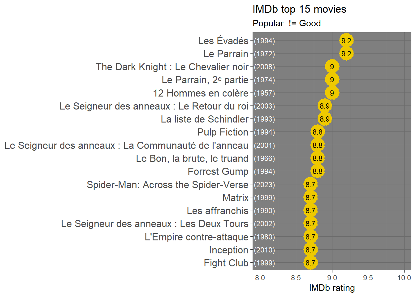
As usual, we’ll start by replicating the R4Dev session, beginning by scraping the top 250 most popular movies according to IMDb.
Check out my code
library(tidyverse)library(rvest)library(RColorBrewer)# Save the URL of the page we want ####imdb_top_url <-"https://www.imdb.com/chart/top/"# Scrape ! ####imdb_top_250_raw <- imdb_top_url %>%# Read the page rvest::read_html() %>%# Pull chosen objects rvest::html_elements(".titleColumn a, .secondaryInfo, strong") %>%# Turn into text rvest::html_text() %>%# Turn into a tibbleas_tibble()imdb_top_250_raw %>%# Lets create a variable that identified each row type: Title, Year and Rating dplyr::mutate(category =rep(c("title","year","score"),times=n()/3)) %>%# Now we pivot the data to wider, but given that we have lots of variables with the same values (years, for instance), we have to do another trick by unnesting the lists that are created by default tidyr::pivot_wider(names_from = category, values_from = value, values_fn = list) %>% tidyr::unnest(cols =everything()) %>%# Now we can rename our variables and plot dplyr::mutate(rating =as.numeric(score)) %>% dplyr::slice_max(n=15,order_by = rating) %>%# plotggplot(aes(x=title %>%reorder(rating),y=rating))+geom_point(color="gold2",size=8)+geom_text(aes(label=rating),size=3,color="black")+geom_text(aes(label=year,y=8.5),size=3,color="white",hjust=2)+coord_flip()+ylim(c(8,10))+labs(x=NULL,y="IMDb rating",title ="IMDb top 15 movies",subtitle="Popular != Good")+theme_dark()+theme(axis.text.y =element_text(size =12))
Live by no man’s code
Using the webscraping tools we practiced on IMdB, along with some tools from previous sessions, let’s do a sentiment analysis of Bob Dylan’s lyrics.
Bob Dylan has a catalogue of over 700 songs, the lyrics to which can be found on the website https://www.bobdylan.com/songs/. However, the website seems a bit incomplete, and only around 500 of these actually have lyrics on the site, so we’ll have to do a bit of filtering later to get the right set of words.
Check out my code
library(tidyverse)library(rvest)library(tidytext)# Extract all song lyrics URLs ####dylan_urls <-"https://www.bobdylan.com/songs"|># First step as before rvest::read_html() |># We select the element we want, which is the link to every song rvest::html_elements(".song a") |># We extract the link to each song by picking an attribute, which for links is href rvest::html_attr("href") |> tibble::as_tibble() |># We keep only one variable which is the URL of each song dplyr::transmute(url = value)# Create an empty list and save all song lyrics using a loop ###dylan_lyrics <-list()for(i in dylan_urls$url) { dylan_lyrics[[i]] <- rvest::read_html(i) |># Extract what we want rvest::html_elements(".lyrics") |># Make it into text rvest::html_text() |>as_tibble() }
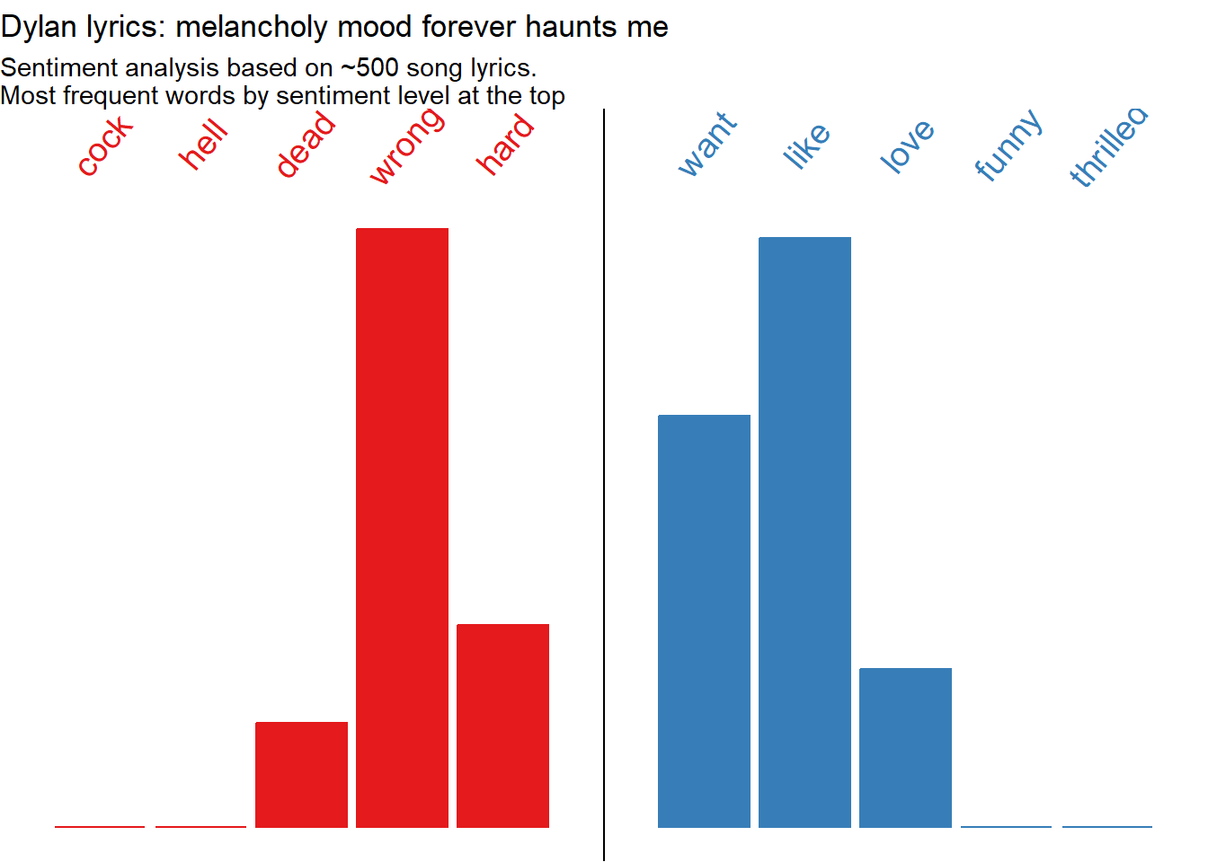
Now that the lyrics are all in a tibble, we can un-nest the elements, name them and bind them together, resulting in a dataset where the lyrics to each song are in their own row. Then we can proceed to the sentiment analysis process we used on books a few sessions ago, in which we tokenize by words, remove stopwords, and join our dataset to a sentiment lexicon (in this case we use AFINN). Then we feed the data into a plot to visualize the sentiment distribution of Dylan’s lyrics.
Check out my code
library(tidyverse)library(tidytext)library(textdata)lyrics_clean1 <- dylan_lyrics |># Identify each list with the url using imap purrr::imap(~mutate(.x, url=.y)) |># Bind into a data frame all lyrics purrr::map_df(bind_rows) |> dplyr::filter(!str_detect(value,"Click")) |># Unnest words tidytext::unnest_tokens(input ="value", output ="text", token ="words") |># Remove stopwords dplyr::anti_join(stopwords::stopwords("en") |>as_tibble(), by=c("text"="value")) |># Join sentiment lexicon dplyr::inner_join(tidytext::get_sentiments("afinn"), by=c("text"="word")) |># Calculate most frequent word by sentiment lexicon dplyr::group_by(text) |> dplyr::mutate(word_freq =n()) |> dplyr::ungroup() |># Summarise #### dplyr::group_by(value) |> dplyr::mutate(n =n(),p = n/sum(n),c =case_when(value<0~"Negative", value==0~"Neutral", value>0~"Positive") |>factor())# Visualise with ggplotlyrics_clean1 |>ggplot(aes(x=value,y=n,fill=c, color=c))+geom_col()+# Notice how the data is filtered inside of the geom ####geom_text(data = . %>% dplyr::group_by(value) %>% dplyr::slice_max(n=1, order_by = word_freq) %>% dplyr::distinct(text, .keep_all =TRUE),aes(y=4300000, label=text), angle=50, size=5)+geom_vline(xintercept =0)+scale_x_continuous(breaks=seq(from=-5,to=5,by=1))+scale_y_continuous()+scale_fill_brewer(palette ="Set1")+scale_color_brewer(palette ="Set1")+labs(title ="Dylan lyrics: melancholy mood forever haunts me",subtitle ="Sentiment analysis based on ~500 song lyrics.\nMost frequent words by sentiment level at the top",x="Sentiment lexicon: AFINN",y="Word frequency")+theme_void()+theme(legend.position ="none")
We can see that Dylan’s words trend negative, but more on the gloomy side of negative than downright terrible. The notable exception is level 2 (somewhat positive), where the most common word is “like”, appearing 613 times. But this seems like it could be a mis-categorization, particularly for an artist who uses similes as much as Dylan does. A quick scan of the songs including the word ‘like’ reveals that it is almost always used as a preposition rather than a verb (e.g. “Like a Rolling Stone”, “Just Like a Woman”, “there’s no success like failure”), and as such has no positive or negative connotation. So let’s try again, removing the word “like” along with the stopwords. While we’re at it we can tweak some aesthetics of the labels.
Check out my code
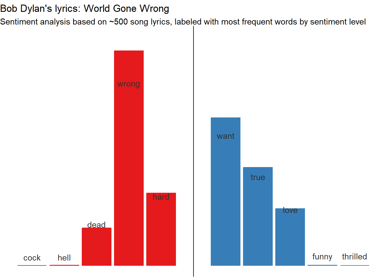
library(tidyverse)library(tidytext)library(textdata)lyrics_clean <- dylan_lyrics |># Identify each list with the url using imap purrr::imap(~mutate(.x, url=.y)) |># Bind into a data frame all lyrics purrr::map_df(bind_rows) |># Get rid of pages that just have an invitation to click to see list of live performances instead of lyrics dplyr::filter(!str_detect(value,"Click")) |># Unnest words tidytext::unnest_tokens(input ="value", output ="text", token ="words") |># Remove stopwords(and "like") dplyr::filter(!text =="like") |> dplyr::anti_join(stopwords::stopwords("en") |>as_tibble(), by=c("text"="value")) |># Join sentiment lexicon dplyr::inner_join(tidytext::get_sentiments("afinn"), by=c("text"="word")) |># Calculate most frequent word by sentiment lexicon dplyr::group_by(text) |> dplyr::mutate(word_freq =n()) |> dplyr::ungroup() |># Summarise #### dplyr::group_by(value) |> dplyr::mutate(n =n(),p = n/sum(n),c =case_when(value<0~"Negative", value==0~"Neutral", value>0~"Positive") |>factor())# Visualise with ggplotlyrics_clean |>ggplot(aes(x=value,y=n,fill=c, color=c))+geom_col()+# Filter data within geom to create labels with top word in each category ####geom_text(data = . %>% dplyr::group_by(value) %>% dplyr::slice_max(n=1, order_by = word_freq) %>% dplyr::distinct(text, .keep_all =TRUE),aes(label = text),vjust =c(-.8,-.8,-7,-35.7,-12.3,-24.6,-16.5,-10.2,-.8,-.8), colour ="gray19")+geom_vline(xintercept =0)+scale_x_continuous(breaks=seq(from=-5,to=5,by=1))+scale_y_continuous(limits =c(0,4000000))+scale_fill_brewer(palette ="Set1")+scale_color_brewer(palette ="Set1")+labs(title ="Bob Dylan's lyrics: World Gone Wrong",subtitle ="Sentiment analysis based on ~500 songs, labeled with most frequent words by sentiment level",x="Sentiment lexicon: AFINN",y="Word frequency")+theme_void()+theme(legend.position ="none")
The trend towards melancholy lyrics shows up even more clearly here, and the Bard’s favorite gloomy word (showing up a whopping 95 times in the Dylan discography) is wrong. To quote the title track of his 29th studio album: “I can’t be good, baby / Honey, because the world’s gone wrong.”
However, while wrong is the top word of the top category, it’s not actually the word that shows up the most often in his lyrics. The next graph shows the top 10 most frequent words in the Dylan dataset (again excluding stopwords). It turns out that despite his general trend towards the lugubrious, Dylan’s number one word is love.
Check out my code
library(tidyverse)library(tidytext)library(textdata)lyrics_clean |>ungroup() |> dplyr::distinct(text, .keep_all =TRUE) |> dplyr::slice_max(n=10, order_by = word_freq) |>ggplot(aes(x=reorder(text, word_freq),y=word_freq,fill=word_freq))+geom_col(show.legend =FALSE)+coord_flip()+theme_classic()+scale_fill_distiller(palette="YlGnBu", direction=1)+# Labelslabs(x =NULL, y ="Frequency",title ="The Words of a Generation",subtitle ="Top 10 most frequent words in Bob Dylan's lyrics")
I’d like to scrape some words, do Eunoia guy?
The website Eunoia purports to contain over 700 “untranslatable” words from 80+ languages, but only shows 30 at a time. In this section we’ll use a for loop to scrape the full word list. At first I tried looping until there were 700 unique words (using the code “while (length(unique(eunoia_list$Word)) < 700))”), but that was apparently a never-ending loop. Instead, I used a trial-and-error method of running it an increasing number of times until the number of unique words stopped increasing. I also ran a few spot checks by comparing the number of words for a given language on the website vs in my dataset.
Check out my code
# Load the required packageslibrary(rvest)# Define the URL of the websiteeunoia_site <-"https://eunoia.world/"# Create empty tibbleeunoia_list <-tibble(word =character(), definition =character(), language =character())# Loop a crazy number of times until we max out the number of unique wordsfor (i inc(1:300)) { eunoia_list <- eunoia_list %>% dplyr::bind_rows(read_html(eunoia_site) %>% rvest::html_elements("td:nth-child(1), td:nth-child(2), td:nth-child(3)") %>% rvest::html_text() %>%matrix(ncol =3, byrow =TRUE) %>%as_tibble() %>%setNames(c("word", "definition", "language")) ) %>% dplyr::distinct(word, .keep_all =TRUE)}# Check total wordsdplyr::n_distinct(eunoia_list$word)
[1] 692
The highest number of words I was able to find was 692, even when I increased the number of batches to 1000 (that one took a while to run). Not quite “700+”, but not too far off. Further testing revealed that we can reliably get all 692 words by running the loop 300 times, so that is the number we are sticking with.
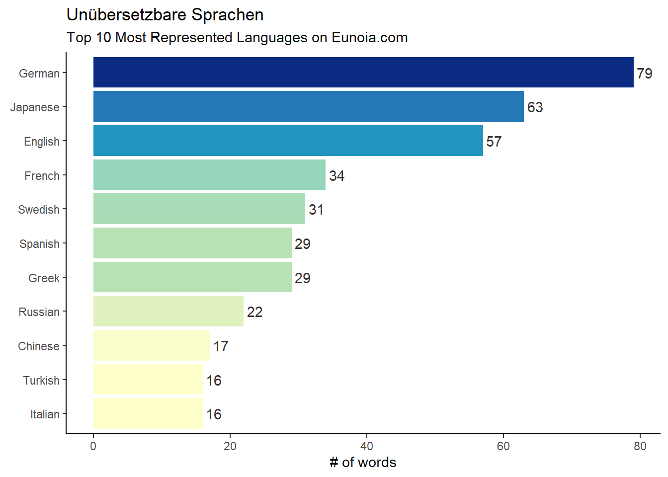
To finish off this session, let’s summarize our word list by source language…which languages are the most untranslatable?
Check out my code
library(ggplot2)library(ggtext)eunoia_list |>group_by(language) |> dplyr::mutate(n =n()) |>ungroup() |> dplyr::distinct(language, .keep_all =TRUE) |> dplyr::slice_max(n=10,order_by = n) |>ggplot(aes(x=language |>reorder(n),y=n, fill = n))+geom_col(show.legend =FALSE)+coord_flip()+geom_text(aes(label = n, hjust =-.2), colour ="gray19")+# Labelslabs(x =NULL, y ="# of words",title ="Unübersetzbare Sprachen",subtitle ="Top 10 Most Represented Languages on Eunoia.com")+scale_fill_distiller(palette ="YlGnBu", direction =1)+theme_classic()
Looks like German (aka the Lego playset of languages) is the most represented in the dataset, with 79 delightful words such as Schnapsidee ~ An idea so stupid the person must have thought of it while drunk, and Krawattenmuffel ~ Someone who’d rather not wear a tie.
In the next post we’ll build a Shiny app to interact with the Eunoia database.
Source Code
---title: "**Getting into scrapes**"title-block-banner: "#8596c7"subtitle: "*The answer, my friend, is blowin' in the wind. The answer is blowin' in the wind*<br>-- Bob Dylan"date: "2023-06-06"image: ice-scraping-ice.gifcategories: [webscraping,API,music,sentiments,ggplot2,rvest]description: "Let's get rvested: using webscraping to pull all the data from all the sites"editor_options: chunk_output_type: console---This post uses the rvest package to scrape the web for data on movies, Bob Dylan song lyrics, and untranslatable words.------------------------------------------------------------------------# IMDbestAs usual, we'll start by replicating the R4Dev session, beginning by scraping the top 250 most popular movies according to IMDb.```{r imdb}library(tidyverse)library(rvest)library(RColorBrewer)# Save the URL of the page we want ####imdb_top_url <-"https://www.imdb.com/chart/top/"# Scrape ! ####imdb_top_250_raw <- imdb_top_url %>%# Read the page rvest::read_html() %>%# Pull chosen objects rvest::html_elements(".titleColumn a, .secondaryInfo, strong") %>%# Turn into text rvest::html_text() %>%# Turn into a tibbleas_tibble()imdb_top_250_raw %>%# Lets create a variable that identified each row type: Title, Year and Rating dplyr::mutate(category =rep(c("title","year","score"),times=n()/3)) %>%# Now we pivot the data to wider, but given that we have lots of variables with the same values (years, for instance), we have to do another trick by unnesting the lists that are created by default tidyr::pivot_wider(names_from = category, values_from = value, values_fn = list) %>% tidyr::unnest(cols =everything()) %>%# Now we can rename our variables and plot dplyr::mutate(rating =as.numeric(score)) %>% dplyr::slice_max(n=15,order_by = rating) %>%# plotggplot(aes(x=title %>%reorder(rating),y=rating))+geom_point(color="gold2",size=8)+geom_text(aes(label=rating),size=3,color="black")+geom_text(aes(label=year,y=8.5),size=3,color="white",hjust=2)+coord_flip()+ylim(c(8,10))+labs(x=NULL,y="IMDb rating",title ="IMDb top 15 movies",subtitle="Popular != Good")+theme_dark()+theme(axis.text.y =element_text(size =12))```# Live by no man's code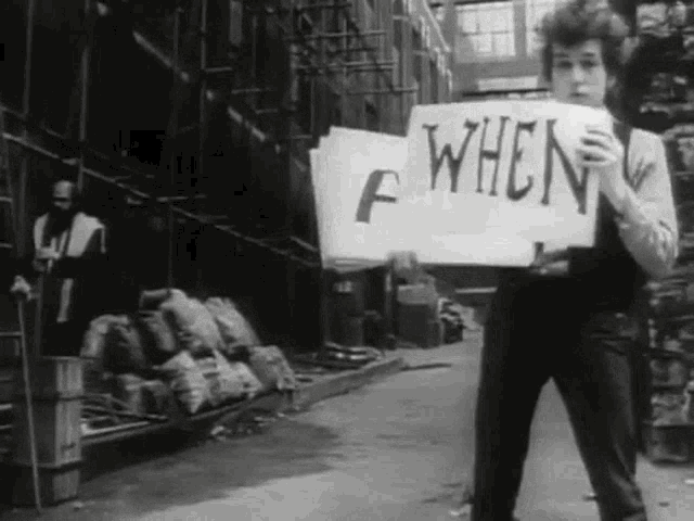{width="580"}Using the webscraping tools we practiced on IMdB, along with some tools from previous sessions, let's do a sentiment analysis of Bob Dylan's lyrics.Bob Dylan has a catalogue of over 700 songs, the lyrics to which can be found on the website https://www.bobdylan.com/songs/. However, the website seems a bit incomplete, and only around 500 of these actually have lyrics on the site, so we'll have to do a bit of filtering later to get the right set of words.```{r dylan}library(tidyverse)library(rvest)library(tidytext)# Extract all song lyrics URLs ####dylan_urls <-"https://www.bobdylan.com/songs"|># First step as before rvest::read_html() |># We select the element we want, which is the link to every song rvest::html_elements(".song a") |># We extract the link to each song by picking an attribute, which for links is href rvest::html_attr("href") |> tibble::as_tibble() |># We keep only one variable which is the URL of each song dplyr::transmute(url = value)# Create an empty list and save all song lyrics using a loop ###dylan_lyrics <-list()for(i in dylan_urls$url) { dylan_lyrics[[i]] <- rvest::read_html(i) |># Extract what we want rvest::html_elements(".lyrics") |># Make it into text rvest::html_text() |>as_tibble() }```Now that the lyrics are all in a tibble, we can un-nest the elements, name them and bind them together, resulting in a dataset where the lyrics to each song are in their own row. Then we can proceed to the sentiment analysis process we used on books a few sessions ago, in which we tokenize by words, remove stopwords, and join our dataset to a sentiment lexicon (in this case we use AFINN). Then we feed the data into a plot to visualize the sentiment distribution of Dylan's lyrics.```{r sentiment}library(tidyverse)library(tidytext)library(textdata)lyrics_clean1 <- dylan_lyrics |># Identify each list with the url using imap purrr::imap(~mutate(.x, url=.y)) |># Bind into a data frame all lyrics purrr::map_df(bind_rows) |> dplyr::filter(!str_detect(value,"Click")) |># Unnest words tidytext::unnest_tokens(input ="value", output ="text", token ="words") |># Remove stopwords dplyr::anti_join(stopwords::stopwords("en") |>as_tibble(), by=c("text"="value")) |># Join sentiment lexicon dplyr::inner_join(tidytext::get_sentiments("afinn"), by=c("text"="word")) |># Calculate most frequent word by sentiment lexicon dplyr::group_by(text) |> dplyr::mutate(word_freq =n()) |> dplyr::ungroup() |># Summarise #### dplyr::group_by(value) |> dplyr::mutate(n =n(),p = n/sum(n),c =case_when(value<0~"Negative", value==0~"Neutral", value>0~"Positive") |>factor())# Visualise with ggplotlyrics_clean1 |>ggplot(aes(x=value,y=n,fill=c, color=c))+geom_col()+# Notice how the data is filtered inside of the geom ####geom_text(data = . %>% dplyr::group_by(value) %>% dplyr::slice_max(n=1, order_by = word_freq) %>% dplyr::distinct(text, .keep_all =TRUE),aes(y=4300000, label=text), angle=50, size=5)+geom_vline(xintercept =0)+scale_x_continuous(breaks=seq(from=-5,to=5,by=1))+scale_y_continuous()+scale_fill_brewer(palette ="Set1")+scale_color_brewer(palette ="Set1")+labs(title ="Dylan lyrics: melancholy mood forever haunts me",subtitle ="Sentiment analysis based on ~500 song lyrics.\nMost frequent words by sentiment level at the top",x="Sentiment lexicon: AFINN",y="Word frequency")+theme_void()+theme(legend.position ="none")```We can see that Dylan's words trend negative, but more on the gloomy side of negative than downright terrible. The notable exception is level 2 (somewhat positive), where the most common word is "like", appearing 613 times. But this seems like it could be a mis-categorization, particularly for an artist who uses similes as much as Dylan does. A quick scan of the songs including the word 'like' reveals that it is almost always used as a preposition rather than a verb (e.g. "Like a Rolling Stone", "Just Like a Woman", "there's no success like failure"), and as such has no positive or negative connotation. So let's try again, removing the word "like" along with the stopwords. While we're at it we can tweak some aesthetics of the labels.```{r sentiment2}library(tidyverse)library(tidytext)library(textdata)lyrics_clean <- dylan_lyrics |># Identify each list with the url using imap purrr::imap(~mutate(.x, url=.y)) |># Bind into a data frame all lyrics purrr::map_df(bind_rows) |># Get rid of pages that just have an invitation to click to see list of live performances instead of lyrics dplyr::filter(!str_detect(value,"Click")) |># Unnest words tidytext::unnest_tokens(input ="value", output ="text", token ="words") |># Remove stopwords(and "like") dplyr::filter(!text =="like") |> dplyr::anti_join(stopwords::stopwords("en") |>as_tibble(), by=c("text"="value")) |># Join sentiment lexicon dplyr::inner_join(tidytext::get_sentiments("afinn"), by=c("text"="word")) |># Calculate most frequent word by sentiment lexicon dplyr::group_by(text) |> dplyr::mutate(word_freq =n()) |> dplyr::ungroup() |># Summarise #### dplyr::group_by(value) |> dplyr::mutate(n =n(),p = n/sum(n),c =case_when(value<0~"Negative", value==0~"Neutral", value>0~"Positive") |>factor())# Visualise with ggplotlyrics_clean |>ggplot(aes(x=value,y=n,fill=c, color=c))+geom_col()+# Filter data within geom to create labels with top word in each category ####geom_text(data = . %>% dplyr::group_by(value) %>% dplyr::slice_max(n=1, order_by = word_freq) %>% dplyr::distinct(text, .keep_all =TRUE),aes(label = text),vjust =c(-.8,-.8,-7,-35.7,-12.3,-24.6,-16.5,-10.2,-.8,-.8), colour ="gray19")+geom_vline(xintercept =0)+scale_x_continuous(breaks=seq(from=-5,to=5,by=1))+scale_y_continuous(limits =c(0,4000000))+scale_fill_brewer(palette ="Set1")+scale_color_brewer(palette ="Set1")+labs(title ="Bob Dylan's lyrics: World Gone Wrong",subtitle ="Sentiment analysis based on ~500 songs, labeled with most frequent words by sentiment level",x="Sentiment lexicon: AFINN",y="Word frequency")+theme_void()+theme(legend.position ="none")```The trend towards melancholy lyrics shows up even more clearly here, and the Bard's favorite gloomy word (showing up a whopping 95 times in the Dylan discography) is [**wrong**]{.smallcaps}. To quote the title track of his 29th studio album: "I can't be good, baby / Honey, because the world's gone wrong."However, while wrong is the top word of the top category, it's not actually the word that shows up the most often in his lyrics. The next graph shows the top 10 most frequent words in the Dylan dataset (again excluding stopwords). It turns out that despite his general trend towards the lugubrious, Dylan's number one word is [*love.*]{.smallcaps}```{r top_words}library(tidyverse)library(tidytext)library(textdata)lyrics_clean |>ungroup() |> dplyr::distinct(text, .keep_all =TRUE) |> dplyr::slice_max(n=10, order_by = word_freq) |>ggplot(aes(x=reorder(text, word_freq),y=word_freq,fill=word_freq))+geom_col(show.legend =FALSE)+coord_flip()+theme_classic()+scale_fill_distiller(palette="YlGnBu", direction=1)+# Labelslabs(x =NULL, y ="Frequency",title ="The Words of a Generation",subtitle ="Top 10 most frequent words in Bob Dylan's lyrics")```# I'd like to scrape some words, do Eunoia guy?The website Eunoia purports to contain over 700 "untranslatable" words from 80+ languages, but only shows 30 at a time. In this section we'll use a *for loop* to scrape the full word list. At first I tried looping until there were 700 unique words (using the code "while (length(unique(eunoia_list\$Word)) \< 700))"), but that was apparently a never-ending loop. Instead, I used a trial-and-error method of running it an increasing number of times until the number of unique words stopped increasing. I also ran a few spot checks by comparing the number of words for a given language on the website vs in my dataset.```{r eunoia}# Load the required packageslibrary(rvest)# Define the URL of the websiteeunoia_site <-"https://eunoia.world/"# Create empty tibbleeunoia_list <-tibble(word =character(), definition =character(), language =character())# Loop a crazy number of times until we max out the number of unique wordsfor (i inc(1:300)) { eunoia_list <- eunoia_list %>% dplyr::bind_rows(read_html(eunoia_site) %>% rvest::html_elements("td:nth-child(1), td:nth-child(2), td:nth-child(3)") %>% rvest::html_text() %>%matrix(ncol =3, byrow =TRUE) %>%as_tibble() %>%setNames(c("word", "definition", "language")) ) %>% dplyr::distinct(word, .keep_all =TRUE)}# Check total wordsdplyr::n_distinct(eunoia_list$word)```The highest number of words I was able to find was 692, even when I increased the number of batches to 1000 (that one took a while to run). Not quite "700+", but not too far off. Further testing revealed that we can reliably get all 692 words by running the loop 300 times, so that is the number we are sticking with.To finish off this session, let's summarize our word list by source language...which languages are the most untranslatable?```{r top languages}library(ggplot2)library(ggtext)eunoia_list |>group_by(language) |> dplyr::mutate(n =n()) |>ungroup() |> dplyr::distinct(language, .keep_all =TRUE) |> dplyr::slice_max(n=10,order_by = n) |>ggplot(aes(x=language |>reorder(n),y=n, fill = n))+geom_col(show.legend =FALSE)+coord_flip()+geom_text(aes(label = n, hjust =-.2), colour ="gray19")+# Labelslabs(x =NULL, y ="# of words",title ="Unübersetzbare Sprachen",subtitle ="Top 10 Most Represented Languages on Eunoia.com")+scale_fill_distiller(palette ="YlGnBu", direction =1)+theme_classic()```Looks like German (aka the Lego playset of languages) is the most represented in the dataset, with 79 delightful words such as [***Schnapsidee***]{.smallcaps} \~ *An idea so stupid the person must have thought of it while drunk*, and [***Krawattenmuffel***]{.smallcaps} \~ *Someone who'd rather not wear a tie.*In the next post we'll build a Shiny app to interact with the Eunoia database.