A map is the greatest of all epic poems. Its lines and colors show the realization of great dreams – Gilbert H. Grosvenor
Using spatial data to create static and interactive maps.
map
API
leaflet
countrycode
interactive
SF
Published
April 18, 2023
This post uses a variety of packages to produce increasingly cool maps.
Replication
We’ll start by replicating the R4Dev session.
Part I: Maps 101
Taking it slow with some basic map-making, before we pull out the big guns.
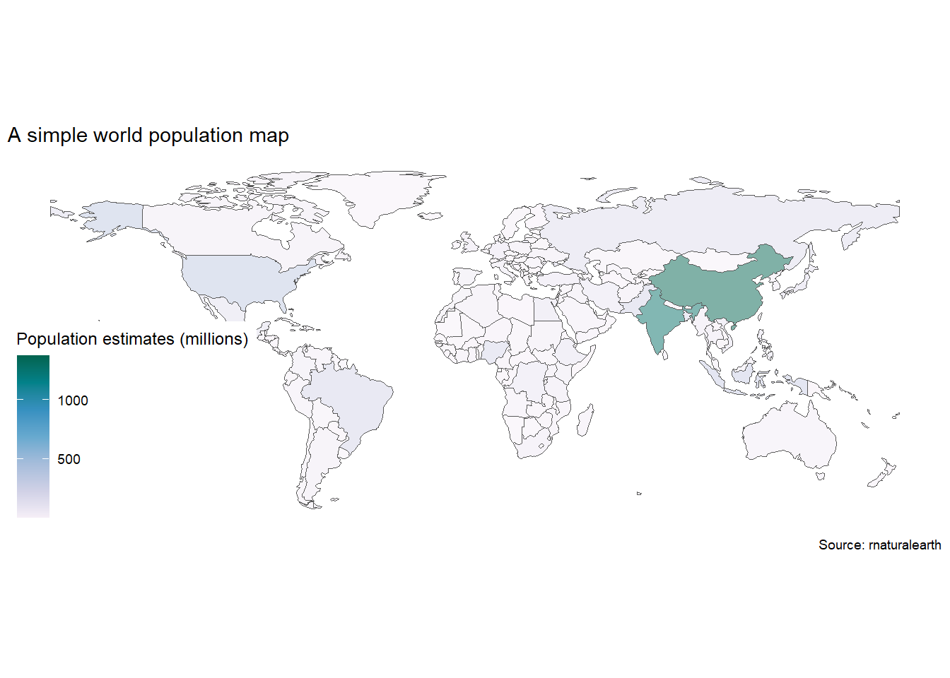
A Simple Map
To demonstrate map-making with simple feature objects, a quick map of population by country.
Check out my code
library(sf) #Simple object packagelibrary(rnaturalearth) #Contains a sf world maplibrary(ggthemes) #Gives us themes for mapslibrary(tidyverse)library(knitr)# let's download the worldmap as a sf file. Look at the file in the Viewer, what is different from other data frames? ####world_sf <- rnaturalearth::ne_countries(returnclass ="sf")# Now population size ####world_sf |># Exclude Antarctica dplyr::filter(iso_a3!="ATA") |>ggplot()+# Use geom_sf and ggplot knows what to do using the geometry data in sfgeom_sf(aes(fill=as.integer(pop_est)/1e6, geometry=geometry), alpha=0.5)+scale_fill_distiller(palette ="PuBuGn", direction=1, name ="Population estimates (millions)")+labs(title="A simple world population map",caption="Source: rnaturalearth")+theme_map()
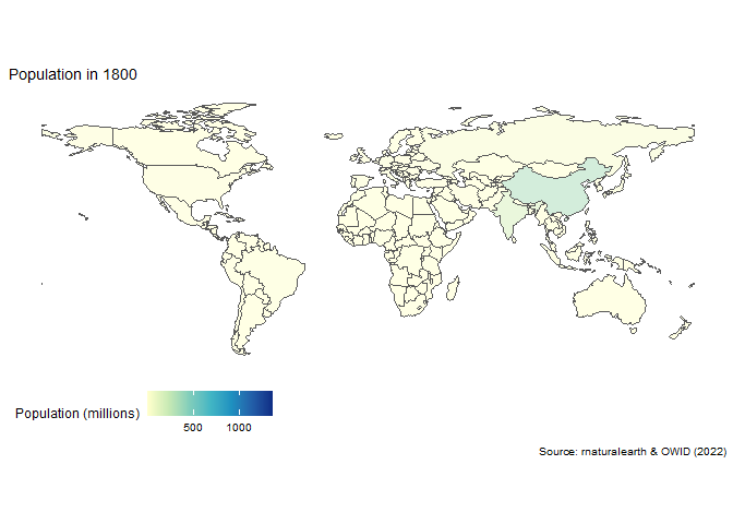
A sucker born every minute
And now an animation of world population over time.
Check out my code
library(tidyverse)library(gganimate)library(transformr)library(countrycode)owid_pop_url <-"https://raw.githubusercontent.com/owid/owid-datasets/master/datasets/Population%20by%20country%2C%201800%20to%202100%20(Gapminder%20%26%20UN)/Population%20by%20country%2C%201800%20to%202100%20(Gapminder%20%26%20UN).csv"world_pop_anim <- readr::read_csv(owid_pop_url) |># Keep end of decade data by country dplyr::filter(str_ends(Year,"0"), Year<2020) |># Rename variables dplyr::select(year = Year, country=Entity,pop=4) |># Add country codes dplyr::mutate(iso3c = countrycode::countrycode(country,"country.name","iso3c")) |># Join sf map dplyr::right_join(world_sf |> dplyr::select(iso_a3,geometry), by=c("iso3c"="iso_a3")) |> dplyr::filter(iso3c!="ATA") |>ggplot()+# Use geom_sfgeom_sf(aes(fill=pop/1e6, geometry=geometry), alpha=0.5)+scale_fill_distiller(palette ="YlGnBu", direction=1,name ="Population (millions)", na.value ="grey75")+labs(title="Population in {frame_time}",caption="Source: rnaturalearth & OWID (2022)")+theme_map()+theme(legend.position ="bottom")+ gganimate::transition_time(as.integer(year))+ gganimate::ease_aes('linear')animate(world_pop_anim)
Part II: Despair in the US
Now that we know how to use map tools, we can put them to use on an interesting (if not very cheery) topic: opioid overdoses in the US.
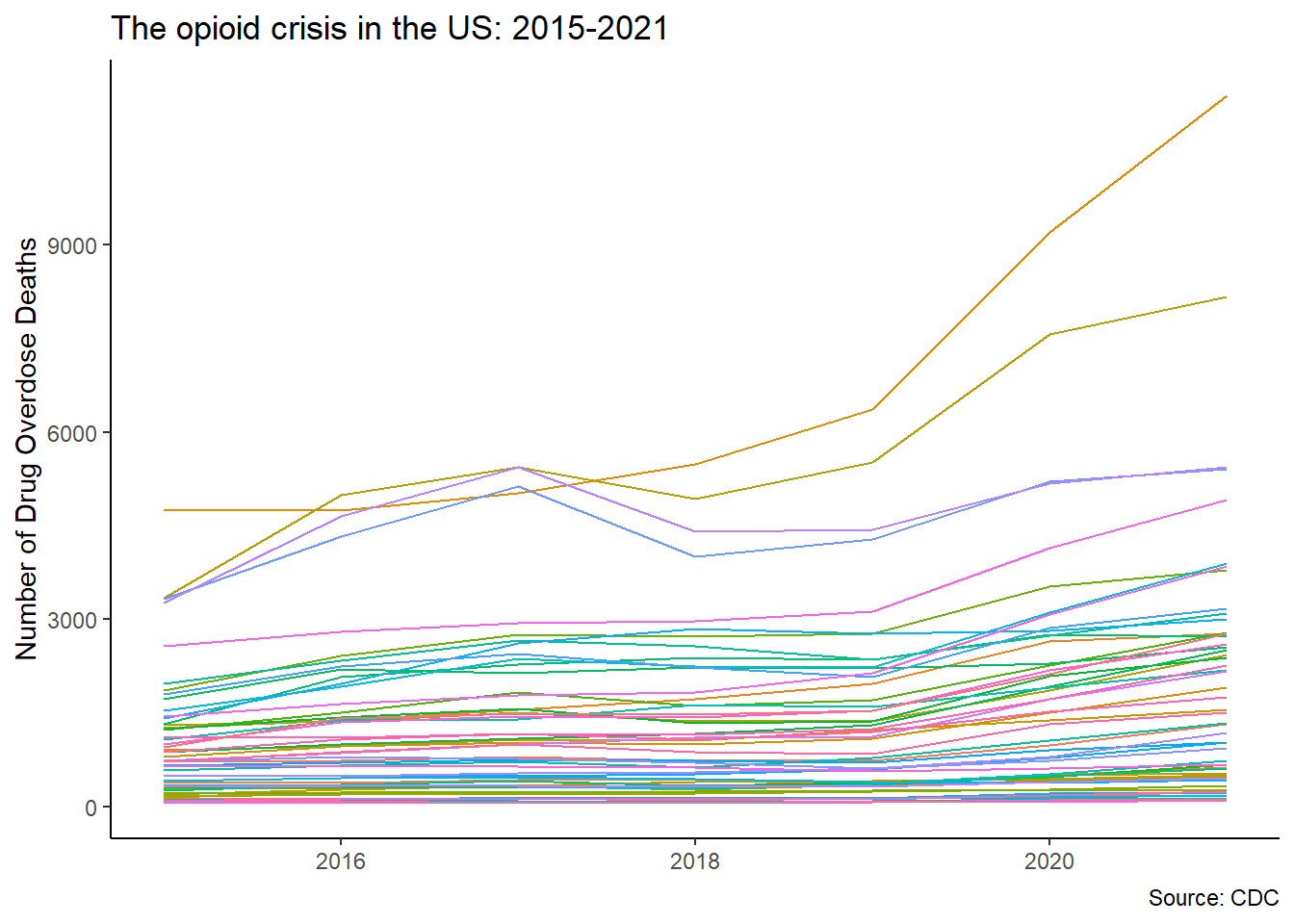
The history of the crisis
Let’s start by downloading CDC data on opioid-related overdoses, by state. Then we can visualize the evolution of the opioid crisis by plotting overdoses over time, by state.
Check out my code
library(RSocrata) #Socrata APIlibrary(tidyverse) #Our other old friend # Get data from CDC portalcdc <-"https://data.cdc.gov/resource/xkb8-kh2a.csv"# Use RSocrata to retrieve the data and filter what we are afteropioid <- RSocrata::read.socrata(cdc) %>%# Filter only the indicator we want dplyr::filter(str_detect(indicator,"Drug Overdose Deaths")) # Plot aggregate dataopioid %>% dplyr::select(state,state_name,year,month,data_value) %>% dplyr::filter(state_name!="United States", year<2022, month=="December") %>%#Exclude aggregated data dplyr::group_by(state,year) %>% dplyr::summarize(opioid =sum(data_value)) %>%ggplot(aes(x=year,y=opioid,color=state))+geom_line(show.legend = F)+labs(x=NULL,y="Number of Drug Overdose Deaths",title="The opioid crisis in the US: 2015-2021",caption ="Source: CDC")+theme_classic()
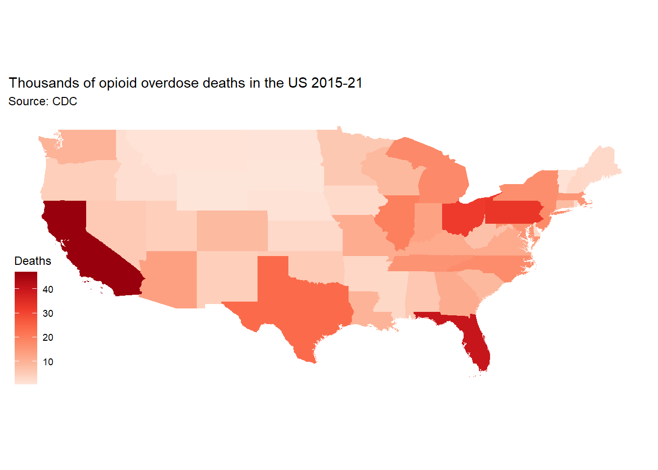
To turn this data into a map, we are going to need some map coordinates for the US, which we’ll get through the geodata package. Then, after cleaning up the opioid dataset a bit, we can join the geography dataset to the opioid dataset.
Check out my code
library(geodata)library(sf)library(tidyverse)library(ggthemes)library(conflicted)conflict_prefer("select","dplyr")conflict_prefer("filter","dplyr")conflicts_prefer(base::setdiff)# Getting coordinates and polygons for the USus <- geodata::gadm(country="USA", level=1, path =getwd())# Transform SpatVector to sfus_state <- sf::st_as_sf(us)# Simplify and summarize the opioid data in a new data frame called opioid2opioid2 <- opioid %>% dplyr::select(state_name,year,month,data_value) %>% dplyr::filter(state_name!="United States",month=="December") %>% dplyr::group_by(state_name) %>% dplyr::summarize(opioid =sum(data_value)/1000) #Change unit to thousands# Join/merge the data with the spatial shapes for mapping stored in us_stateopiod_map <- opioid2 %>%#This command joins/merges the data on the left onto the data on the right using the variables we provide in by=c("left"="right") dplyr::left_join(us_state, by=c("state_name"='NAME_1'))
The where of the despair
Now we are finally ready to map out our data and visualize the hotspots of the US opioid crisis.
Check out my code
library(tidyverse)library(conflicted)library(ggthemes)conflict_prefer("filter", "dplyr")# Now we can map the crisisopiod_map %>%#We'll exclude Alaska and Hawaii to get a better looking map dplyr::filter(!state_name %in%c("Alaska","Hawaii")) %>%# Feed the data into ggplotggplot(aes(fill=opioid))+# We have an sf object, so we just add the geometrygeom_sf(aes(geometry=geometry), color=NA)+#Include a color option that makes a heatmapscale_fill_distiller(palette="Reds", name ="Deaths", direction=1)+labs(title="Thousands of opioid overdose deaths in the US 2015-21",subtitle="Source: CDC")+# A theme for maps, which cleans the backgroundtheme_map()
Part III: Interactivity
Now for our favorite part of every graphing exercise: making it move.
Turning over a new leaflet
We take the simplified dataframe opioid2 (which we created in the previous section) and put it into a new simple features object. We also divide the data into bins and define a color palette for the bins.
Check out my code
library(tidyverse)library(leaflet)library(leaflet.providers)library(widgetframe)# Join the data to a new sf objectus_leaflet <- us_state |> dplyr::left_join(opioid2, by=c('NAME_1'="state_name")) # Define bins and color palette bins <-c(0, 5, 10, 15, 20, 30, 40, Inf)pal <-colorBin("Reds", domain = us_leaflet$opioid, bins = bins, reverse =FALSE)# Time to build a mapus_leaflet %>%# Here we feed the data in the pipe to Leafletleaflet() %>%# Adding Tiles, which is the structure of the mapaddTiles() %>%# Set the default coordinates in the middle of the USsetView(-96, 37.8, 4) %>%# Add a dark tile for a dark topicaddProviderTiles(providers$Stamen.TonerBackground) %>%# Add polygonsaddPolygons(# Add colorsfillColor =~pal(opioid),weight =1,#opacity = 1,dashArray ="2",fillOpacity =0.7,# HighlighthighlightOptions =highlightOptions(weight =5,color ="#962424",dashArray ="",fillOpacity =0.9,bringToFront =TRUE),#Add labelslabel =paste0(us_leaflet$NAME_1, ": ", us_leaflet$opioid))